What this section controls
This section controls collection displays with the following capabilities:- Up to 12 collection items with hover-triggered images
- Interactive image preview on collection hover
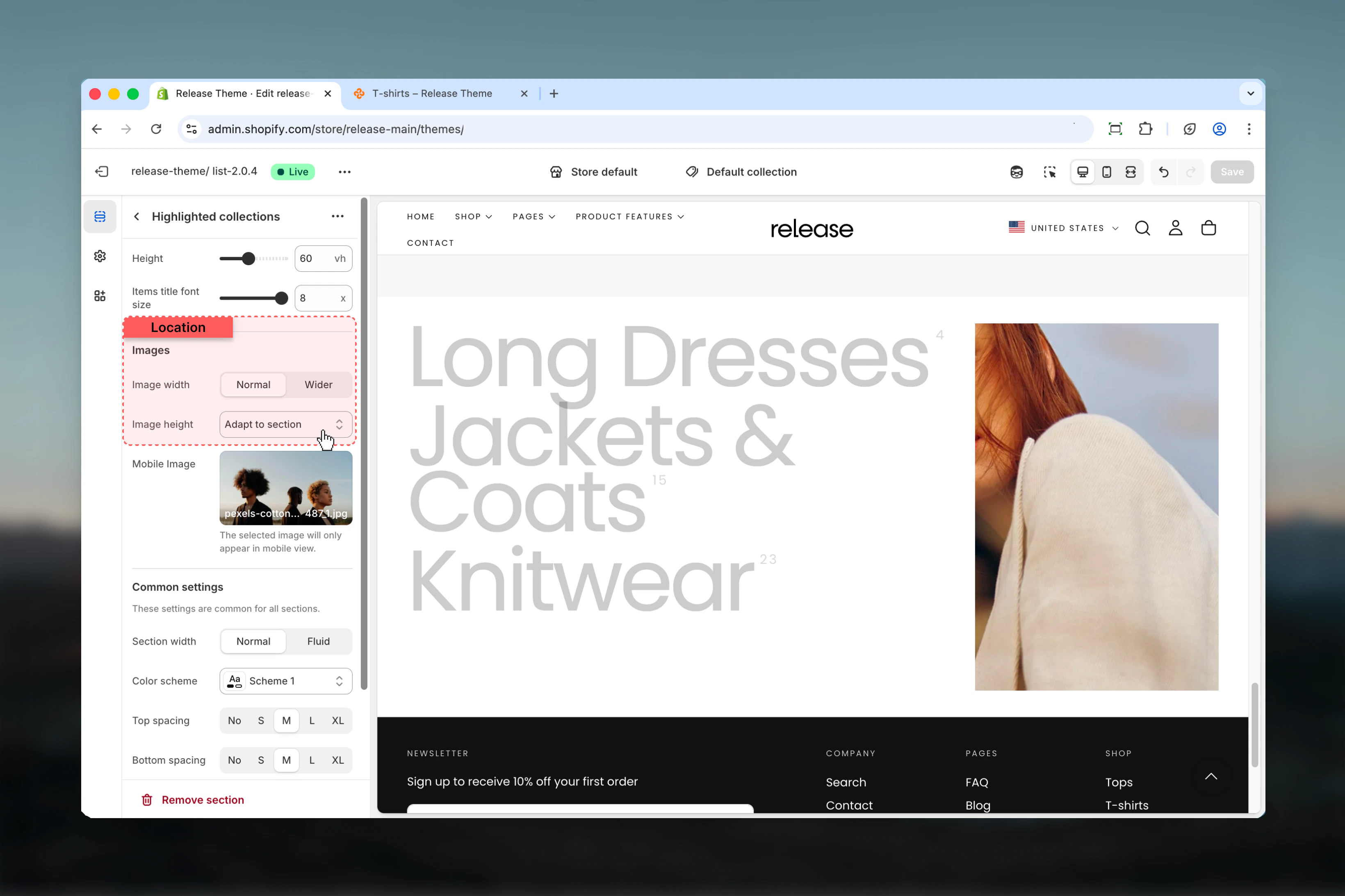
- Customizable section height and title font size
- Custom collection images and titles
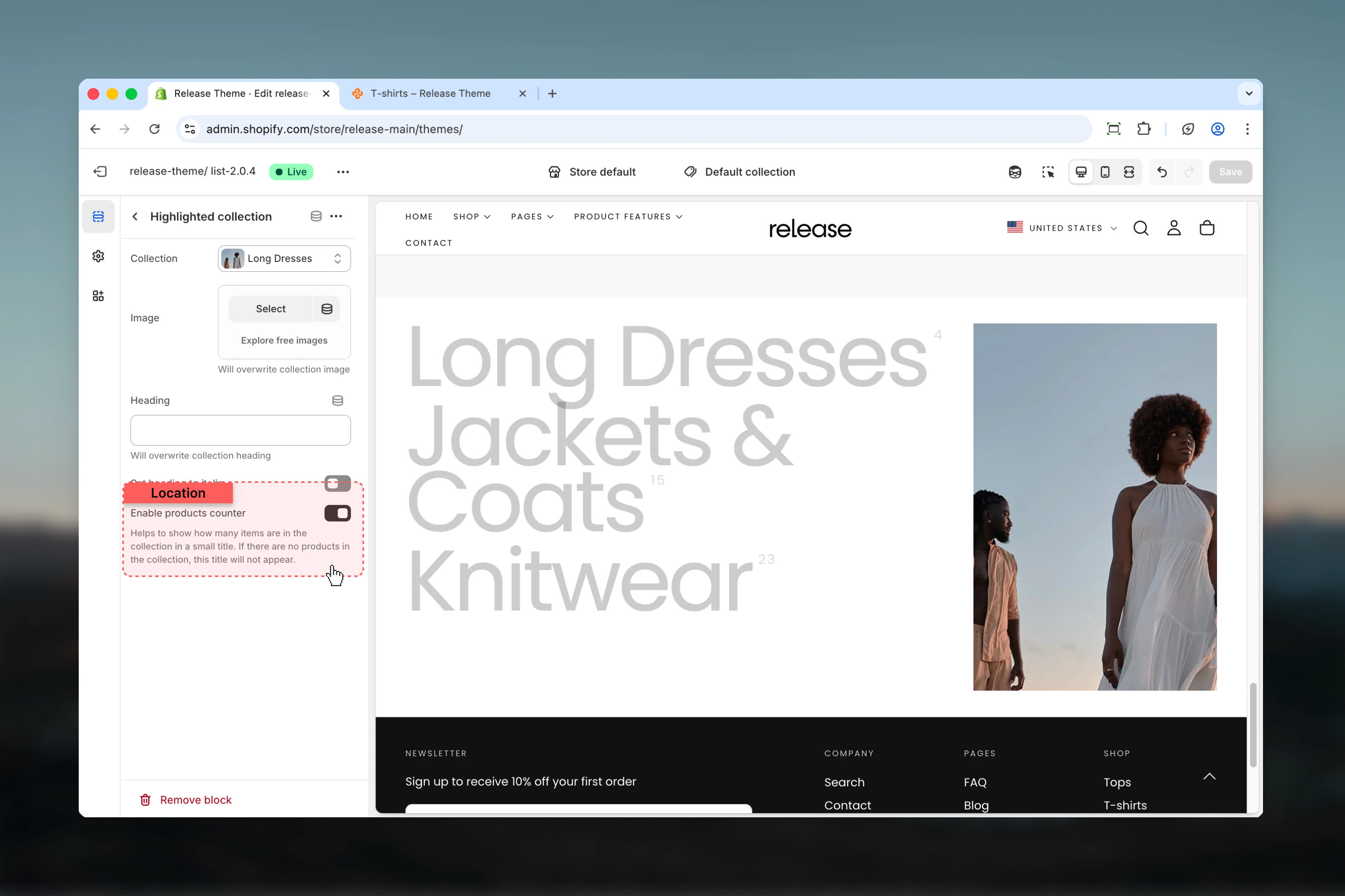
- Product counter display
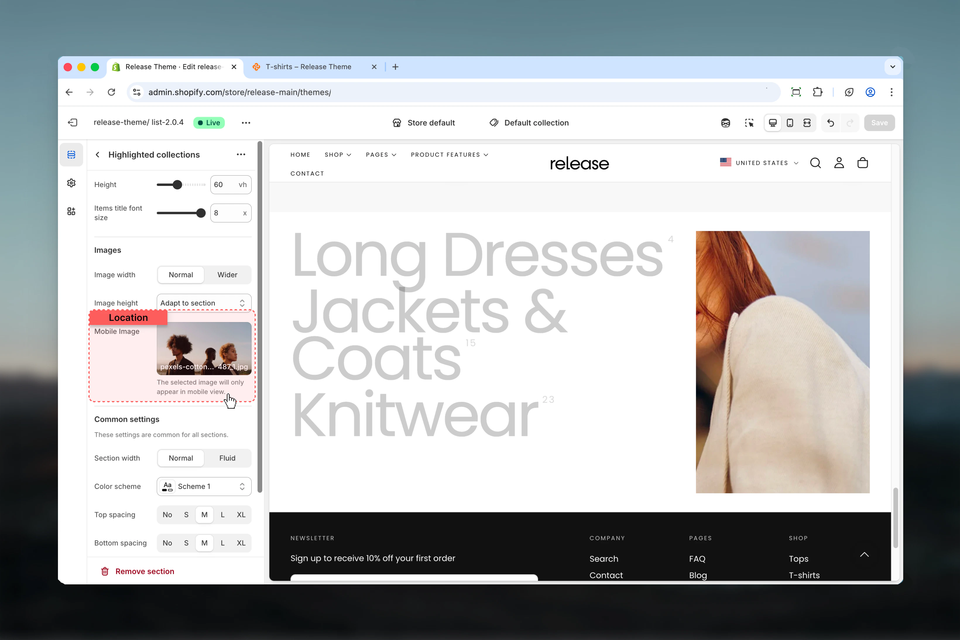
- Mobile-specific image option
- Responsive layout with configurable width ratios
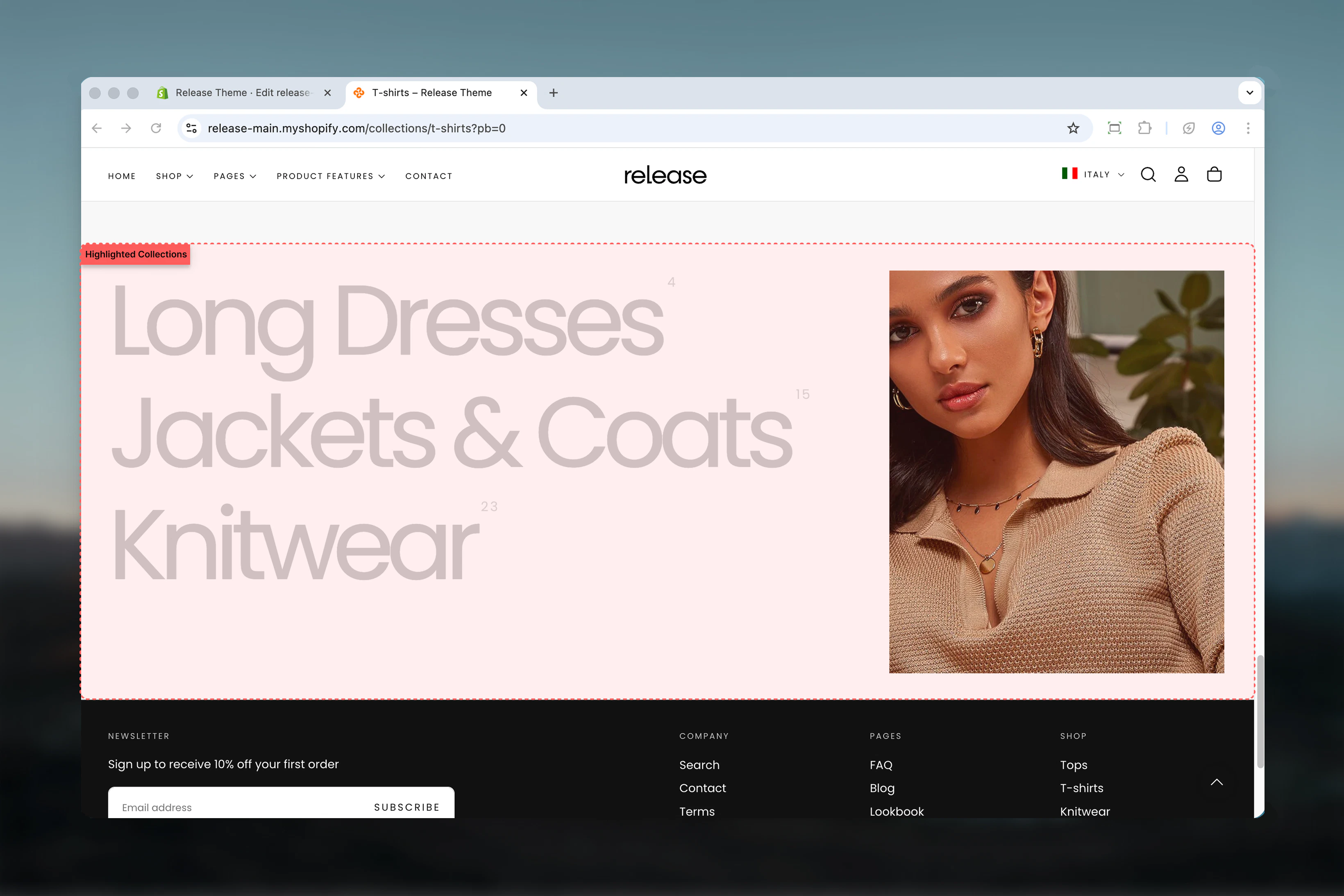
How the Highlighted Collections section works
The Highlighted Collections section uses an interactive hover system:- Displays up to 12 collection items in a vertical list
- Shows collection images on hover
- Collection title, custom image, and product counter support
- Separate mobile image option
- Configurable section height and title font size
- Responsive layout with mobile-specific image handling
Getting started
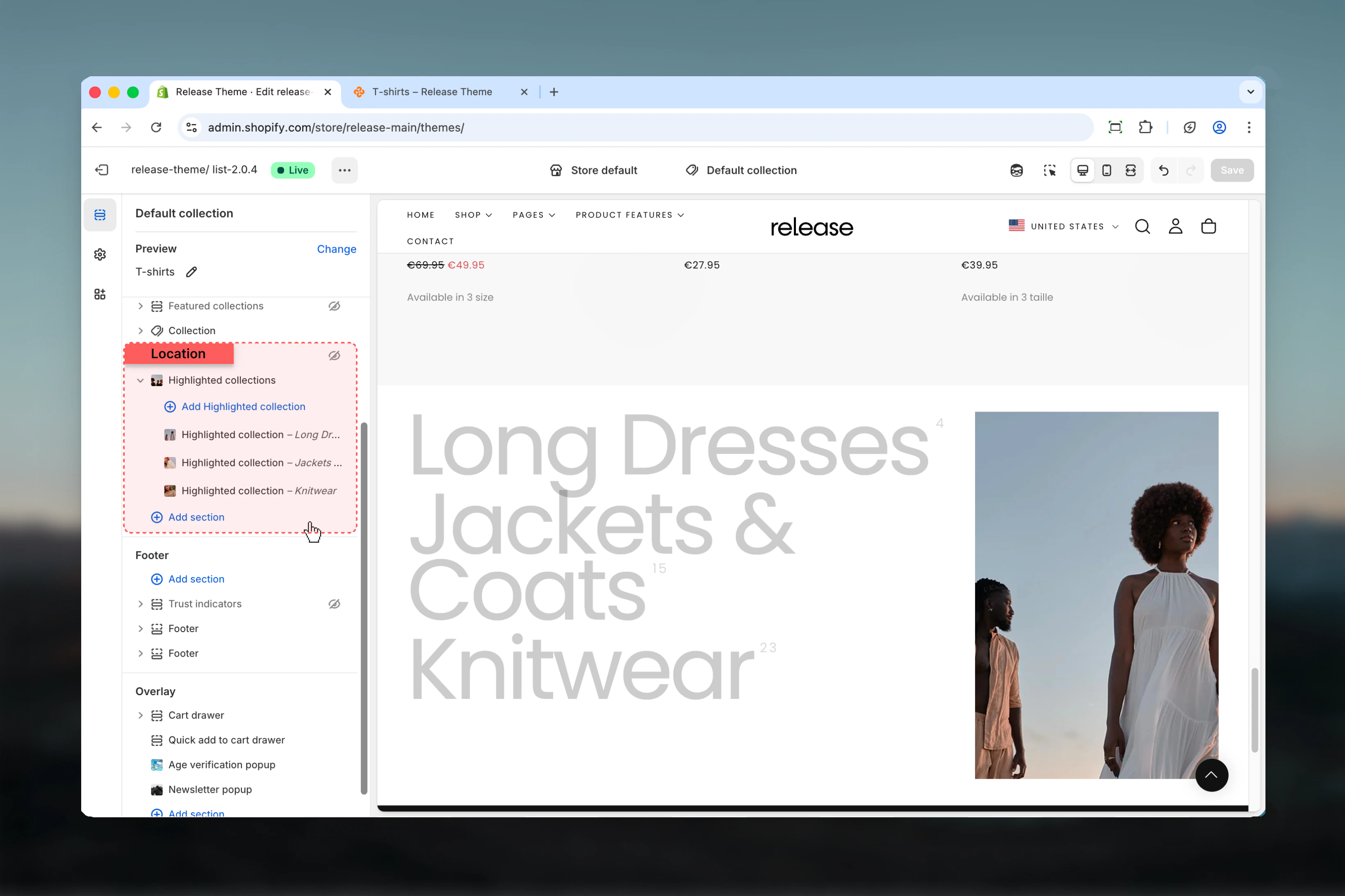
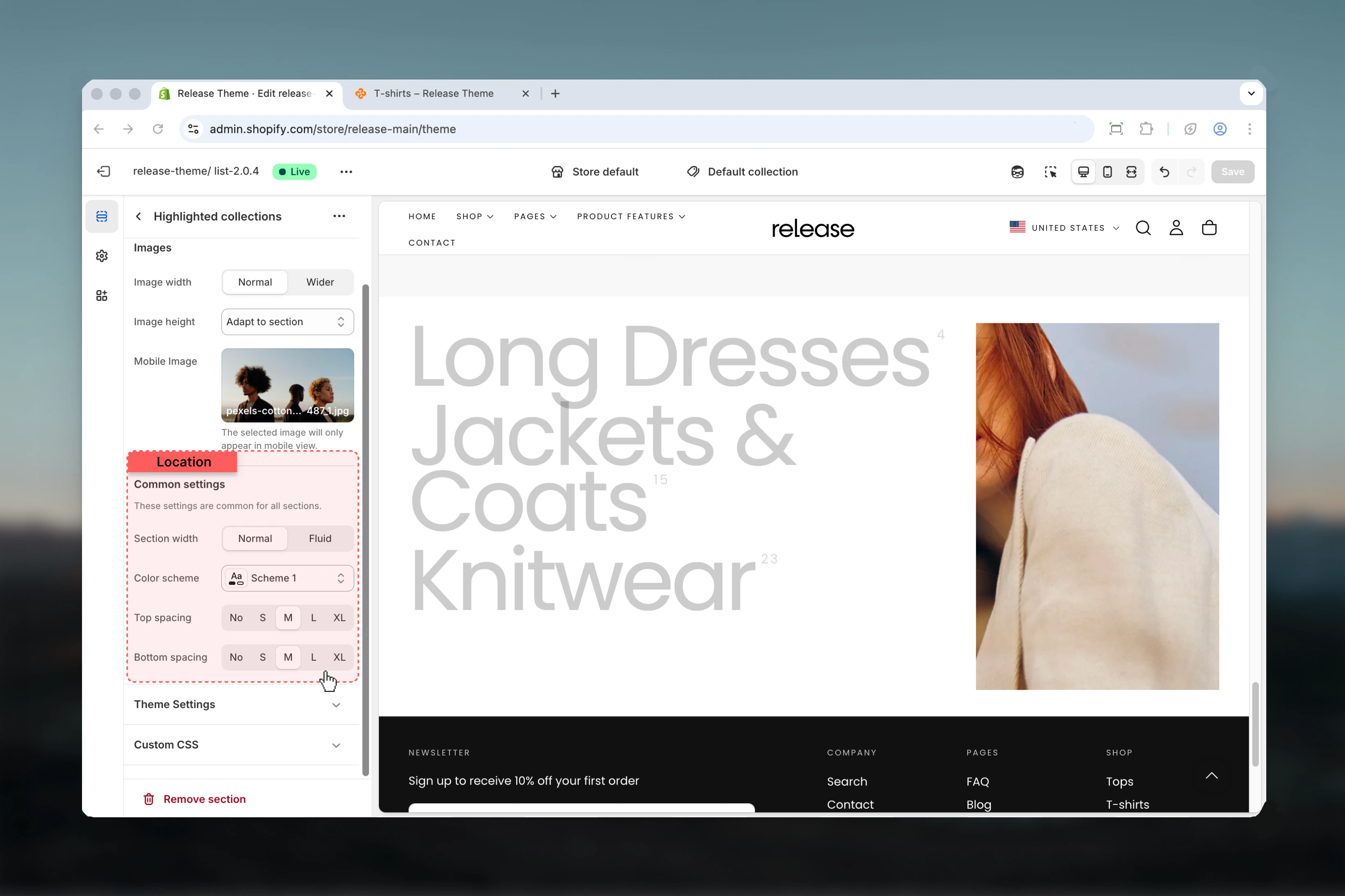
Section settings
Section settings control layout, sizing, and visual styling.- Layout & Sizing
- Images
- Settings


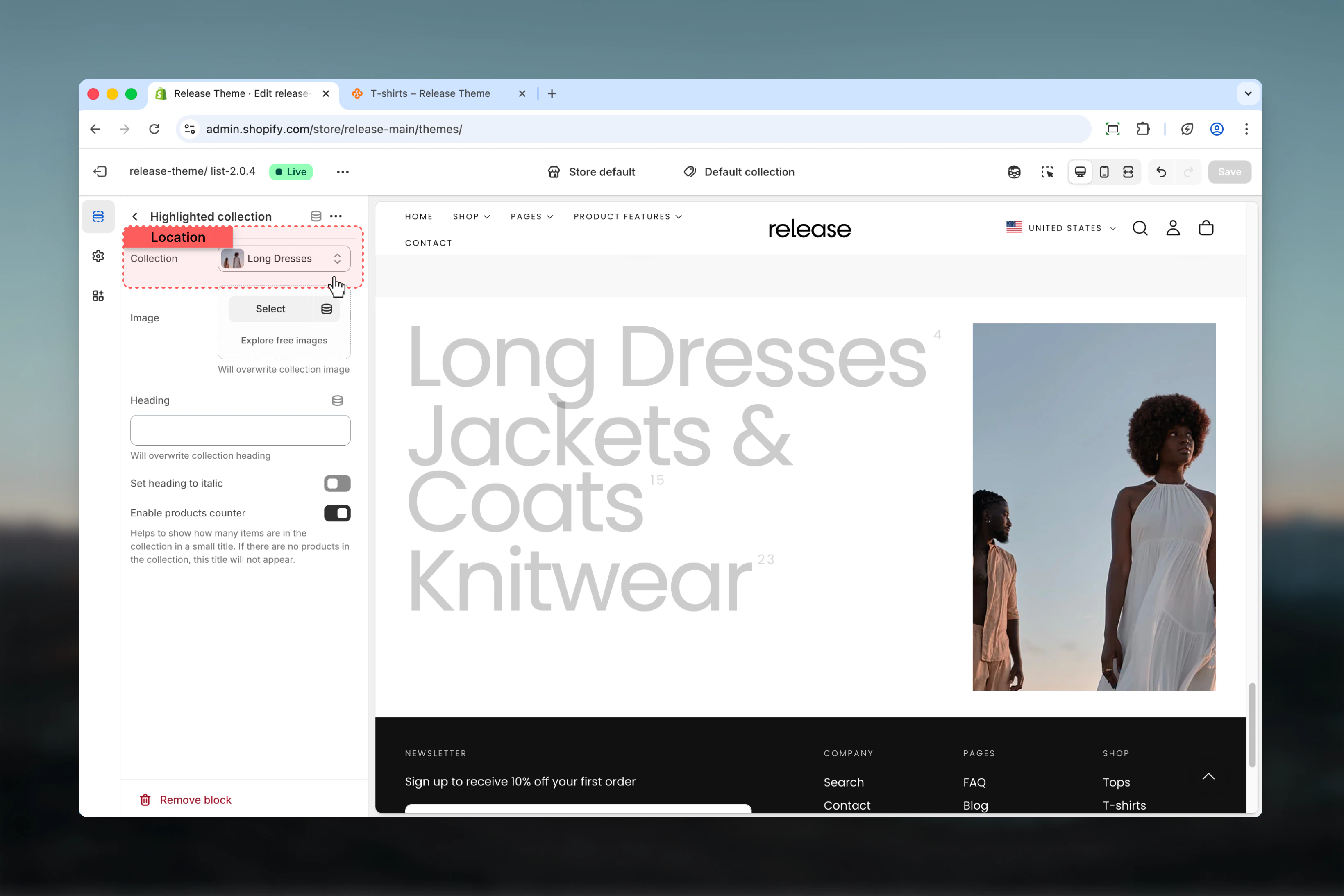
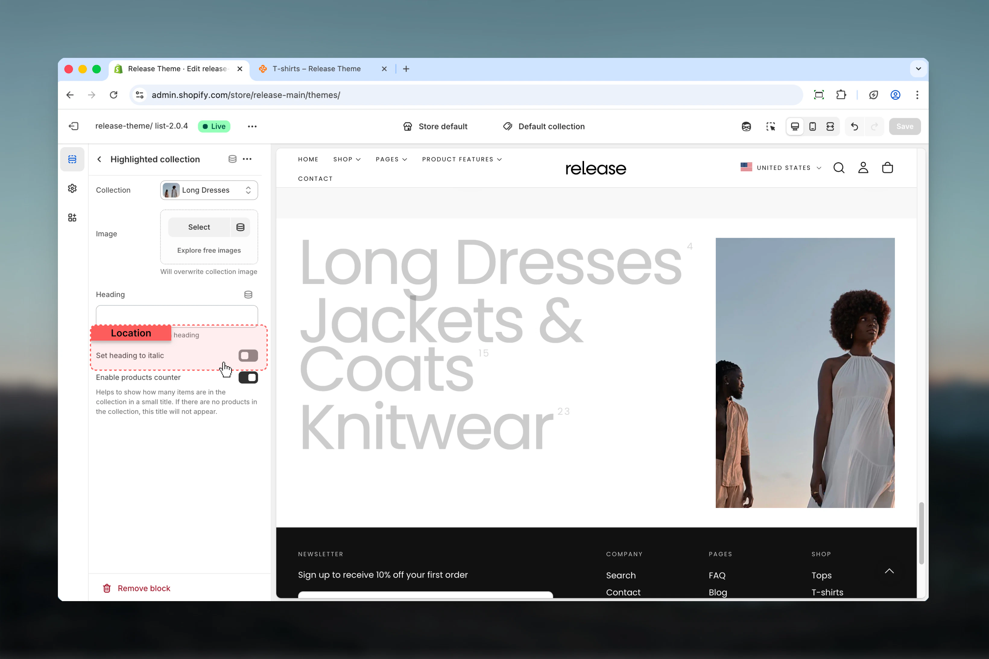
Block settings
Block settings control individual collection items. Each block represents a single collection.- Collection
- Styling
Best practices
- Use high-quality, visually distinct images for each collection to maximize hover impact
- Keep collection titles concise (2-4 words) for quick scanning and elegant display
- Order collections by priority, popularity, or logical browsing flow
- Use consistent image styling and color palette across all collections
- Limit to 6-8 collections for optimal user experience without overwhelming
- Test hover interaction on desktop and touch behavior on mobile devices
- Provide a mobile image that represents all collections well or highlights featured collection
- Use product counter to indicate collection size and help set expectations
- Consider image width ratio based on image quality and visual importance
- Ensure sufficient color contrast for collection titles against background
Common use cases
- Category navigation - Guide customers to main product categories with visual appeal
- Seasonal collections showcase - Highlight seasonal or themed collections
- Brand collections - Display collections organized by brand or designer
- Style guides - Showcase collections based on aesthetic, occasion, or use case
- Featured collection highlight - Draw attention to new or popular collections
- Store directory - Create a visual map of your product offerings for easy navigation
Related guides
Common Settings
Learn about common settings shared across sections