

Presets
Olympus comes with 4 ready-made designs for your store. Each preset is a complete set of sections, blocks, colors and typography that you can install and then adapt to your brand.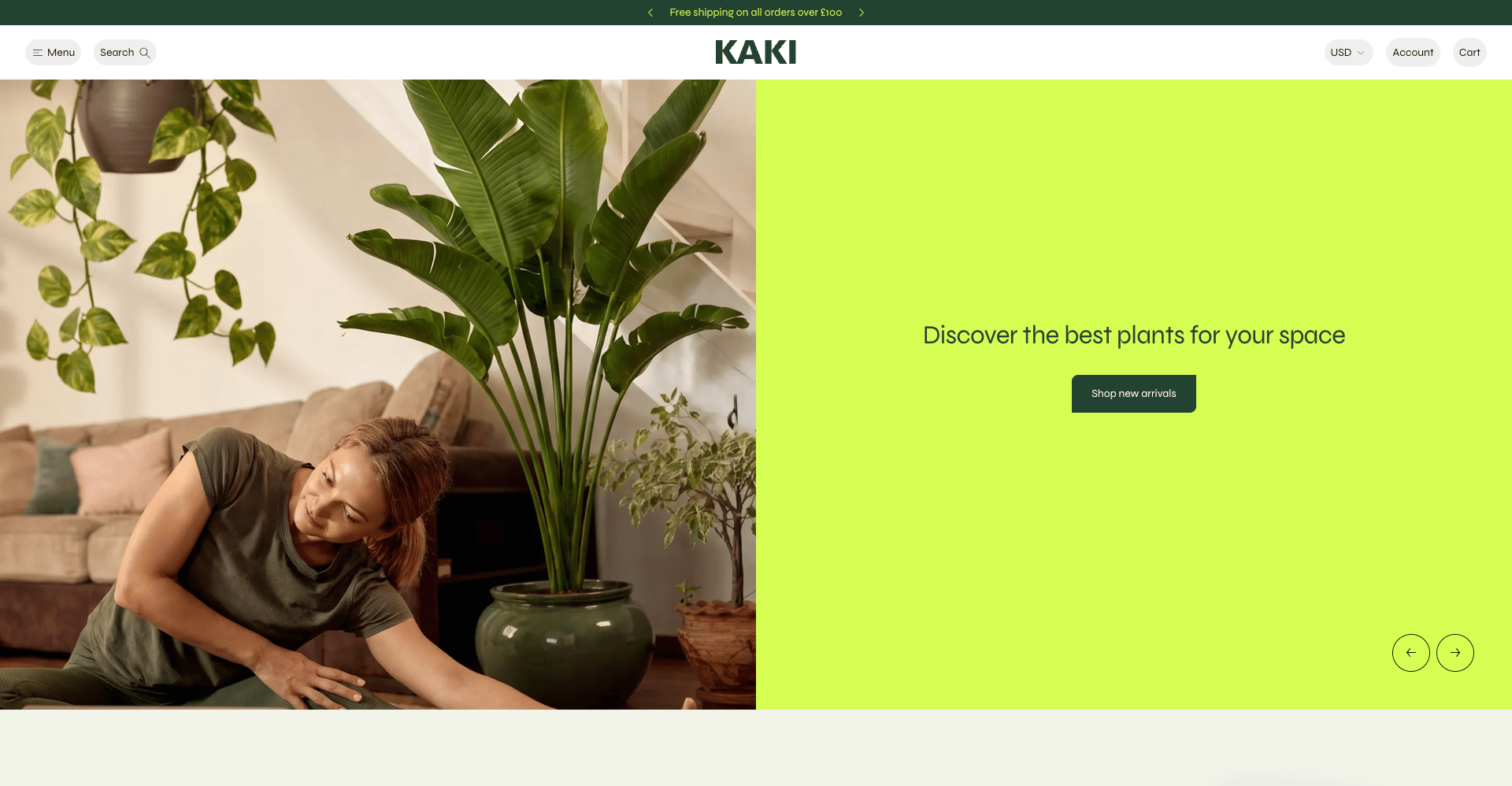
Olympus
The signature design: full-bleed photography and bold color blocks, built for plant, garden and home brands.
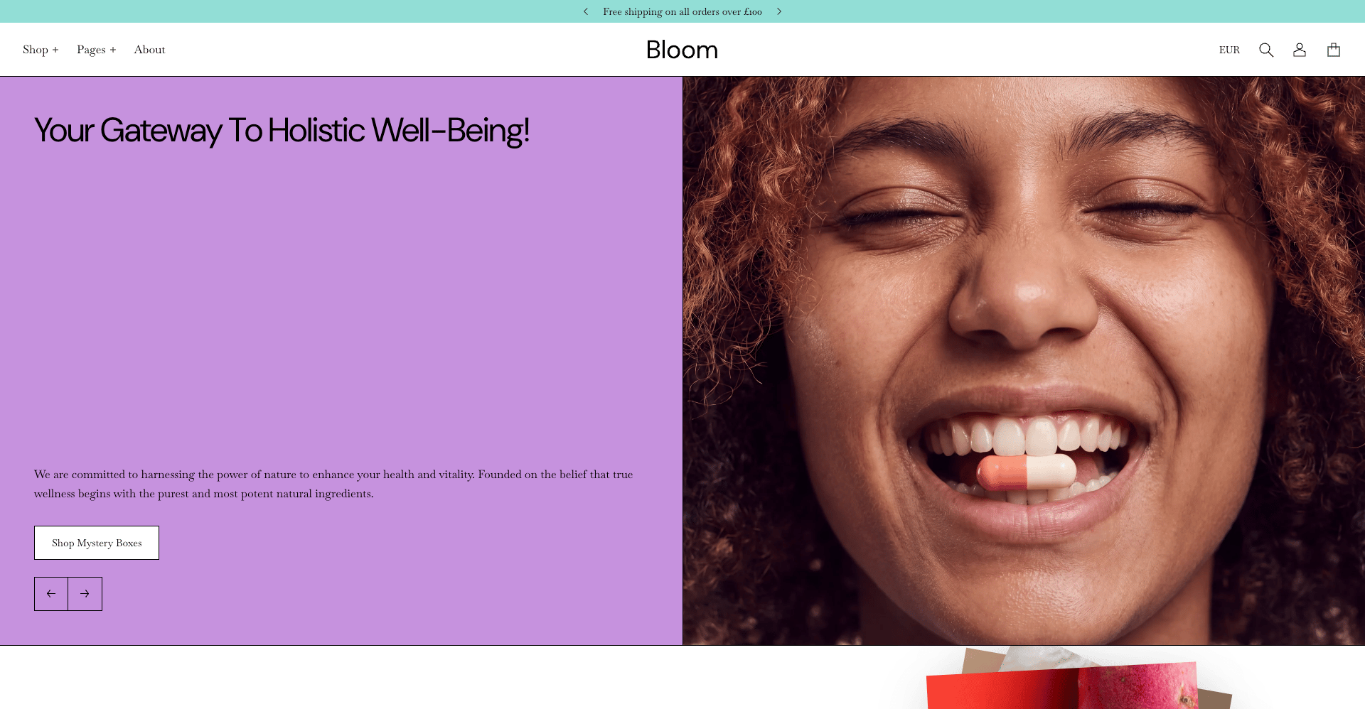
Bloom
A soft, editorial design in deep plum with rounded type and lifestyle imagery, made for wellness and supplement brands.
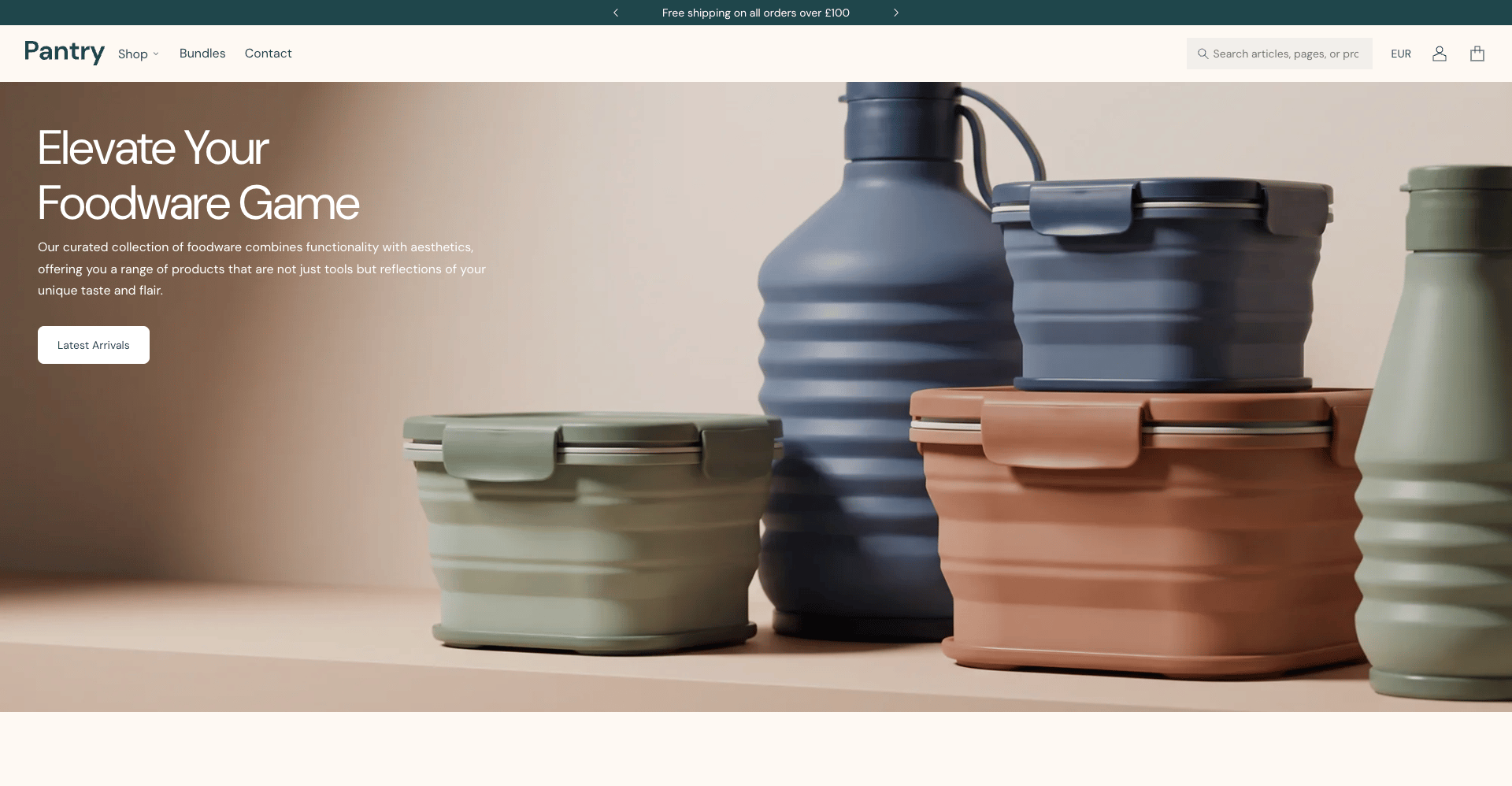
Pantry
A calm, product-led design in muted stone and sage tones, suited to kitchenware, foodware and homeware stores.
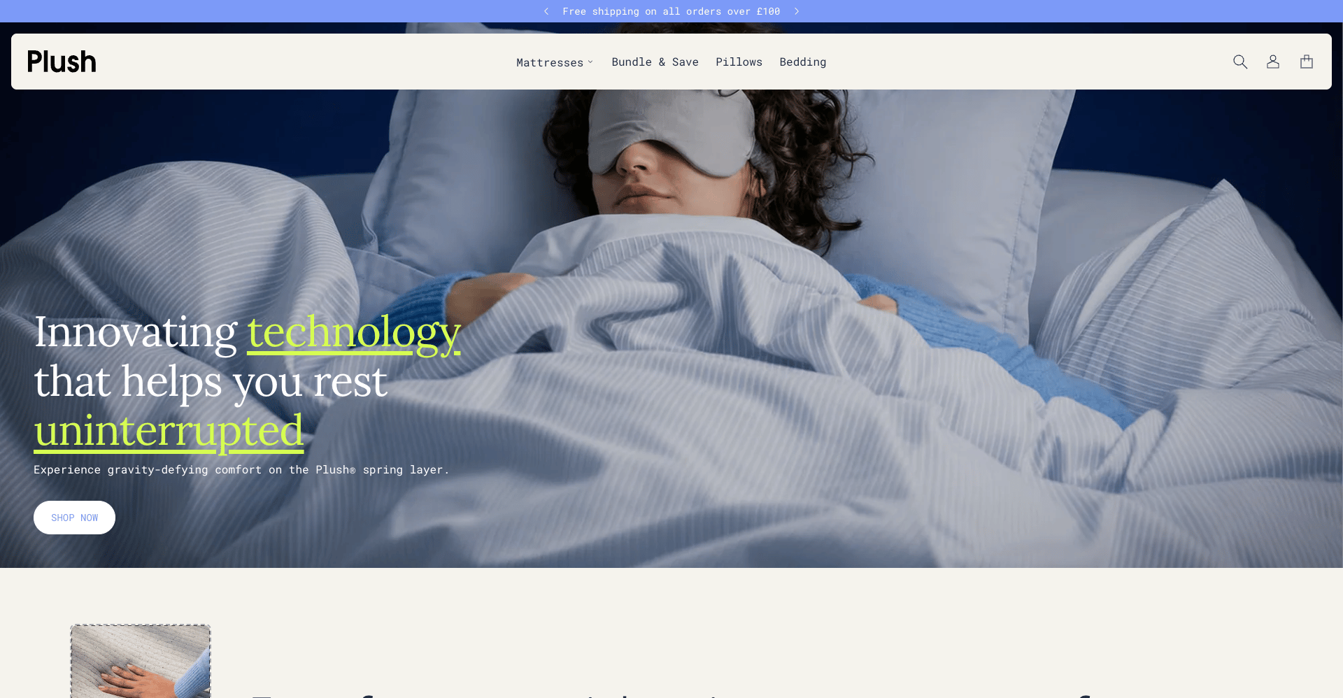
Plush
A dark, photographic design with highlighted headlines and detail-rich product cards, made for mattress, bedding and comfort brands.
Built on theme blocks
In Olympus, sections provide the layout, media, color scheme, and spacing. The content inside them comes from theme blocks: reusable Heading, Text, Button, Image, Video, Label, Badge, Countdown, and Group blocks that you add, reorder, and nest in the Theme Customizer. The same Heading block behaves the same way in a hero banner, a newsletter popup, or a product page, so you learn each block once and reuse it everywhere. Section-specific blocks, such as Slide or Tile, are documented on their own section pages.Theme blocks
Reference for every shared block and its settings, plus how to add, reorder, and nest blocks.
Products
Product Page (PDP)
Block-based product page with media gallery, variants, and purchase controls.
Product groups
Link separate products to behave like variants using swatches, images, or text.
Product badges
Highlight products with sale, sold out, and custom tag-based badges.
Gift Card
Gift card product template and digital gift card page.
Collections
Collection Page (PLP)
Product grid with filtering, sorting, and promotional content cards.
Collection list page (CLP)
Display all or selected collections in a grid.
Search
Search results with filtering and sorting.
Pages & Templates
404 Error Page
Customizable error page that guides lost visitors back to your store.
Blog & Article
Blog listing and block-based individual article layout.
Cart page
Full-page cart with item management and checkout actions.
Contact
Contact page template with form and supporting content.
FAQ
Categorized questions and answers with accordion layout.
Page Template
Generic content template for About, policies, and more.
Password page
Coming soon page for pre-launch stores.
Customer accounts
Account dashboard, login, register, addresses, and order details.
Sections & Theme Settings
Sections
Browse the full library of sections available for any page in your store.
Theme Settings
Control typography, layout, grid, corners, buttons, cards, colors, and cart behavior.
Header & Footer
Set up navigation, announcement bar, mega menu, logo, and footer content.
Apps
Embed third-party Shopify apps for reviews, wishlists, live chat, and more.
Resources
Common settings
Width, spacing, section border, and color scheme controls shared by most sections.
Changelog
See what is new and what has changed in each Olympus release.